

GÜEY CBD - Packaging Design
Güey’s founders knew exactly who they wanted to show up for & serve because they themselves saw an open space for Hemp/CBD tinctures that were both premium and cleanly produced.
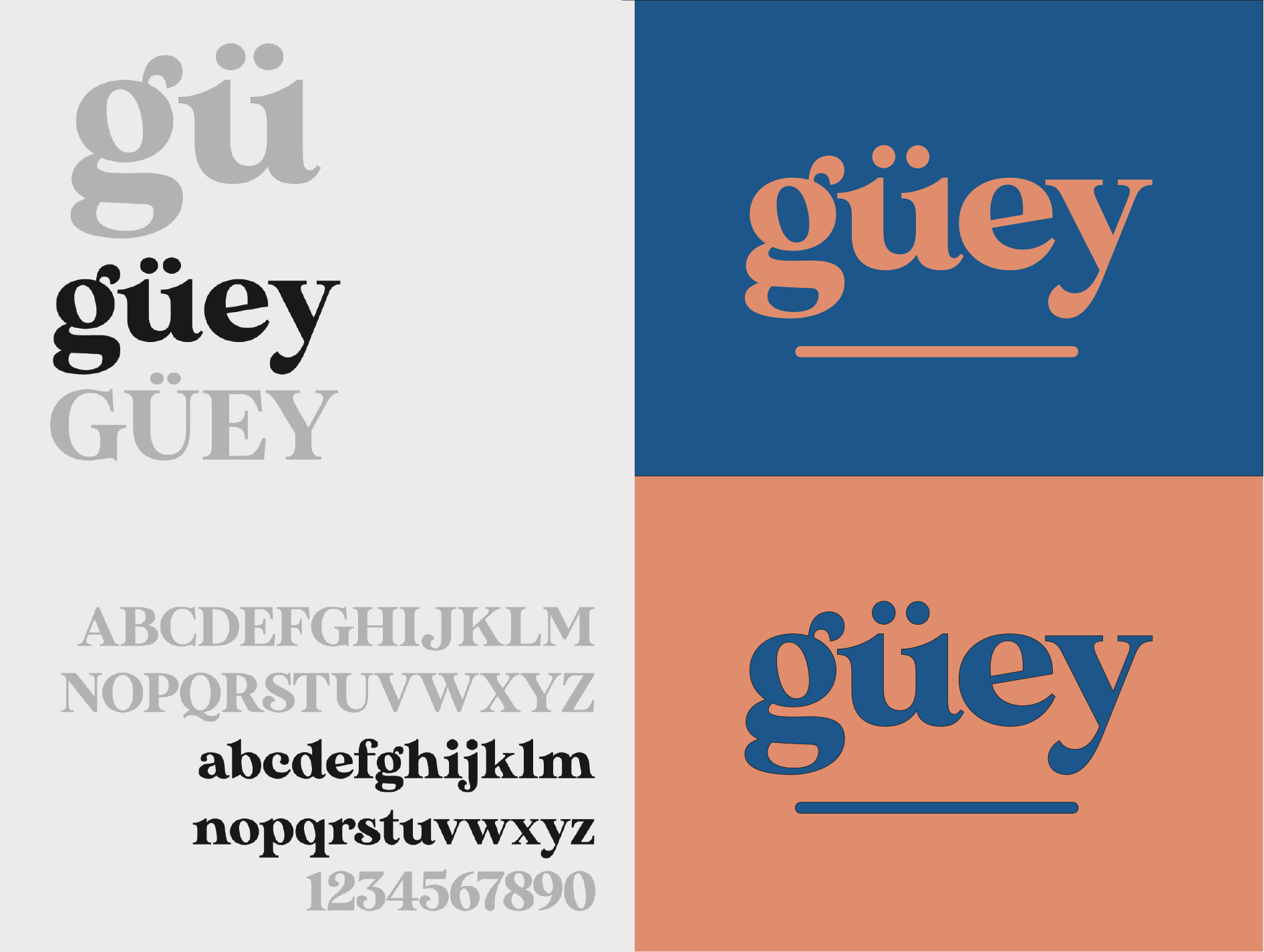
Our team, in collaboration with crafted a look & feel that spoke to Güey’s niche, craft hemp extracts. The Güey aesthetic includes high-contrast colors for visibility to customers looking for something different than the jumble of products already on shelf.
Using color psychology, classic blue was chosen as the primary brand color because it indicates purity within the human mind. It is counter-balanced by rose gold, that visually communicates a high-end experience.


The Güey brand was founded with the intention to create a top-notch CBD experience that would stand out in a heavily-populated, unregulated hemp-derived product market.